Introduction

This ad campaign is Adidas Running Campaign photo by Arec Studio, copywriter by Marco De Rosa, Art Director by Alessandro Poila, and Creative Director by Marco Peyrano.
Original Ad Analysis
Design
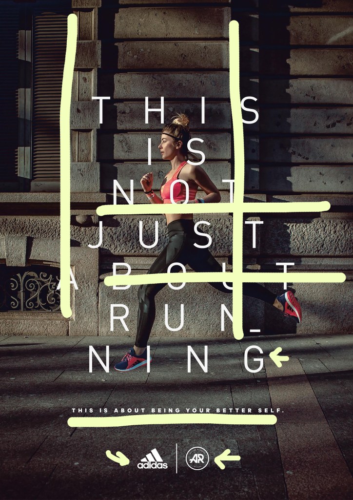
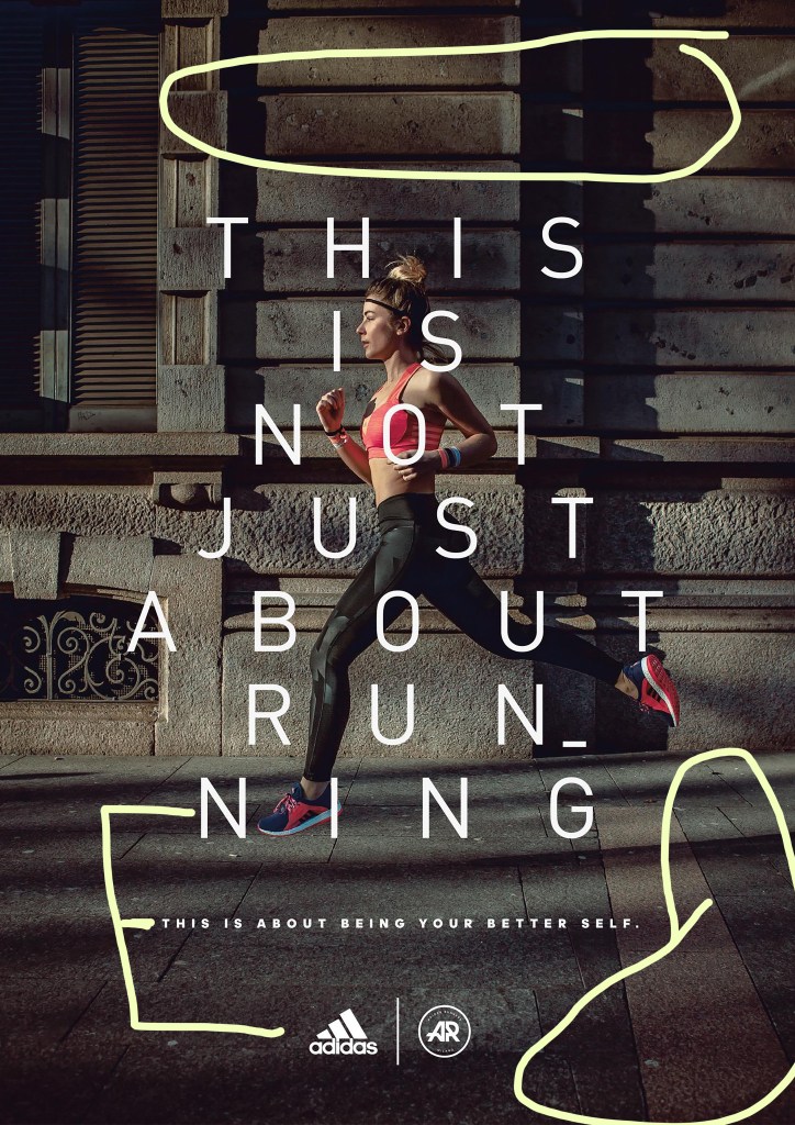
When you see this ad first, probably the woman running would be the first thing to catch your eye. I would like to point out that is emphasis which one area in a work of art stands out more than another and the part that catches your attention first. It also has use of Contrast with building bricks with very dark shadows and pink tops and shoes. The lines of bricks and the second sentence “THIS IS ABOUT BEING YOUR BETTER SELF.” are aligned together. The white font color and logos were used in repetition.
Color
The colors used in this ad are white, pink, black, and dark grey and brown. The color scheme is very simple, but as the dark and light colors match, the part author wants to emphasize looks more prominent. Bra top and running shoes are emphasized, and since there is no shadows on woman so the product itself can be more focused.
Typography
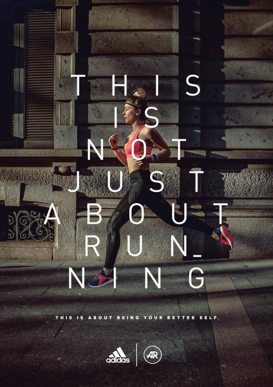
The type that is used in this ad is Sans Serif because it doesn’t have any stroke or decoration, but shows simplicity. Personally, I think this typography is really good because it is simple to read and understand the message of this campaign. If decorative or serif fonts were used in this ad, it would have bee much more formal for running ad and might have been a bit uncomfortable feeling.
New ad Analysis

Design
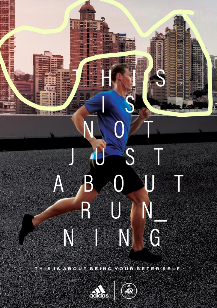
This is the ad I created and tried to show the theme of running in the city. I found the image of road and buildings behind it. I didn’t follow much of the design principles used in original ad, but I would say contrast was a good use of design principles in this new ad. The road is black color and buildings are brown and ivy colors, so the man with blue t-shirt is stood out. And the colors of fonts are used in repetition. I think fonts and the man contrast each other.
Color
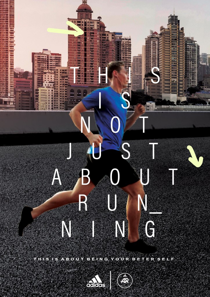
I tried to incorporate a lot of bricks’ dark brown/grey color of original ad to buildings’ color and road color. The use of dark shadows in original ad made the image a bit darker, so I tried to find a similar background image and also made the saturation darkened. I made same white font color and found two white logos.
Typography
Since the Sans Serif is used in original ad, I used similar font in new ad. The logos are exactly the same as in original ad. The second sentence “THIS IS ABOUT BEING YOUR BETTER SELF.” has some space in each word, so I slightly made space between them.
Conclusion
The original ad and new ad is not exactly the same, but we can see these are from the same campaign through the design principles, color scheme, and font. I learned a lot about what fonts should be used, because depending on the subject, we would know whether or not the font is used in the correct situation or theme. If a photo, font, and color scheme come together, we will be able to properly understand the message that Ad Campaign delivers, which makes advertisement success.
