Dasom Kim COMM 130
Niki Make Yourself Ad Campaign

In the fall of 2011. Nike hired Annie Leibovitz as a photographer and campaigned seven elite female athletes to Nike’s “Make Yourself” team. This campaign inspired and motivated women to achieve their goals and be their own version in everywhere, anytime.
Nike Make Yourself Ad is the one I chose for Reverse Engineer Process because I think C.R.A.P are well represented in this picture and personally the message of the advertisement is so good because it shows a fierce woman doing her work!
Contrast

First, the face of the model of the photograph, Sofia Boutella, is spotlighted, but the right side of the image (her left arm) is slightly darker. The two different font styles at the right bottom of the image are used. The font below the “MAKE YOURSELF” sentence is cursive and underlined. The color of the font and the background is contrasting, too.
Repetition

Repetition is a principle that makes you feel the similarity as a whole by continuously repeating certain elements in the screen, such as images, colors, shapes, textures, and so on. There are three Nike logos in this picture, her wrist, sports bra, and pelvis. Even without the word “Nike”, we can infer that the Nike advertisement of these three same logos. Also, the two words Make and Yourself used the same font, indicating that repetition is used.
Alignment

Even though, the elements are not physically close together, they can be seen as integrated through alignment and easy to see those are linked to and related to each information.
Generally, the lines of the body and the words are aligned with each other. The left arm of the image and the beginning of the sentence (or words) are aligned vertically. The underside of the arm and the words are aligned even though they are slightly apart.
Proximity
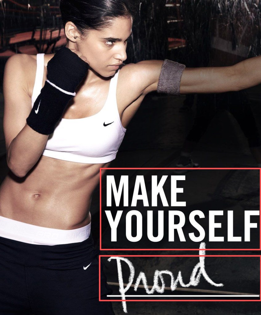
Proximity combines into logical groups, which is athlete in this case, to make it easier for people to navigate what this advertisement is.
The two words above”MAKE” and “Yourself” have the same font. size, and alignment, but the “Proud” below them uses a different font, size, and is slightly tilted. Also, the two words and “proud” are slightly apart, but when read, they are automatically linked together. The sentences are logically linked, and automatically linked to the image of the model doing exercising.
Color

Two colors are used in this image: black and white. Black is used for the background, her gloves, and leggings and white is mainly used for focusing on the sentence, her sports bra, and Nike logos, and the leggings bands on her pelvis.
Conclusion.
It looks like a dynamic photograph, but it has calculative contrast, repetition, alignment, and proximity. Even though this ad doesn’t say it is Nike ad, viewer can guess from the repetitive logo and see where they can focus on the light contrasts and colors. Alignment and proximity let viewer know that it is related information automatically, so they can navigate the ad through the flow of related information.
